
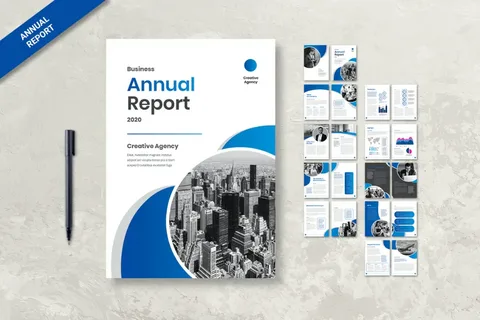
Annual report design plays a vital role in how businesses communicate performance, growth, and strategy to stakeholders. In today’s competitive market, a well-executed annual report design is no longer just about presenting financial data—it is about telling a compelling brand story that builds trust and credibility. Companies now use design to transform complex information into visually engaging and easy-to-understand content that resonates with investors, employees, and partners.
Why Annual Report Design Matters
Annual reports are often the most important corporate communication tool of the year. A poorly designed report can make even strong financial performance appear confusing or unprofessional. On the other hand, a well-structured design enhances clarity and strengthens brand perception.
Good design ensures:
- Clear communication of financial data
- Stronger brand identity
- Improved stakeholder engagement
- Better readability across all platforms
In essence, design directly impacts how your business is perceived.
The Power of Visual Hierarchy
One of the most important principles in annual report design is visual hierarchy. This refers to how information is arranged so that readers naturally follow the content in the right order.
Headlines, subheadings, charts, and key figures must be placed strategically. The goal is to guide the reader’s attention smoothly from one section to another without confusion. When visual hierarchy is ignored, even the most important insights can be overlooked.
Data Visualization for Better Uderstanding
Numbers alone can feel overwhelming. That is why modern annual report design heavily relies on data visualization.
Graphs, pie charts, infographics, and icons help simplify complex financial information. Instead of reading long tables, stakeholders can quickly understand performance trends and key insights through visuals.
Effective data visualization:
- Improves clarity
- Increases engagement
- Enhances memory retention
- Simplifies complex reporting
Storytelling Through Design
A powerful annual report is more than a financial summary—it is a story of growth, challenges, and achievements.
Storytelling in design helps connect data with meaning. Instead of just showing numbers, the report explains what those numbers represent. For example, revenue growth becomes a story about strategy, innovation, and market expansion.
This narrative approach makes the report more engaging and emotionally impactful.
Brand Consistency and Identity
Consistency is essential in professional reporting. Every annual report should reflect the company’s brand identity through colors, typography, and tone of voice.
A consistent design:
- Strengthens brand recognition
- Builds trust with stakeholders
- Creates a professional appearance
- Reinforces corporate values
When stakeholders see a well-branded report, they associate it with credibility and reliability.
Digital Transformation in Reporting
Annual reports are no longer limited to printed documents. Many companies now use digital formats such as interactive PDFs and web-based reports.
These formats allow:
- Clickable charts and sections
- Animated data visualizations
- Multimedia integration
- Easier access across devices
Digital reporting improves engagement and allows readers to explore data in a more interactive way.
Minimalism and Clean Design Trends
Modern annual report design is moving toward minimalism. Clean layouts with ample white space improve readability and reduce cognitive overload.
Instead of overcrowding pages with too much information, designers focus on clarity and simplicity. This approach ensures that the most important messages stand out effectively.
Accessibility and User Experience
A well-designed annual report must be accessible to all users. This means ensuring readability across different devices, including mobile phones, tablets, and desktops.
Key accessibility factors include:
- Readable font sizes
- Proper spacing
- High contrast colors
- Responsive layouts
Good user experience ensures that stakeholders can easily navigate and understand the report.
Conclusion
Annual report design is a powerful communication tool that transforms financial data into meaningful business storytelling. It helps organizations build trust, enhance brand value, and communicate effectively with stakeholders. A strong design strategy ensures clarity, engagement, and professionalism in every report.
At the core of this transformation, agencies like Pepperit play a key role in delivering creative and strategic annual report design solutions that elevate corporate communication and help businesses stand out in a competitive market.